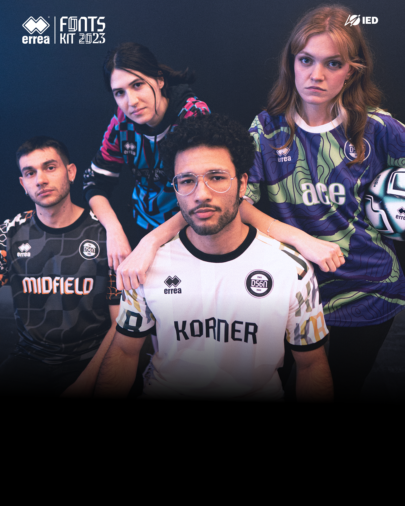
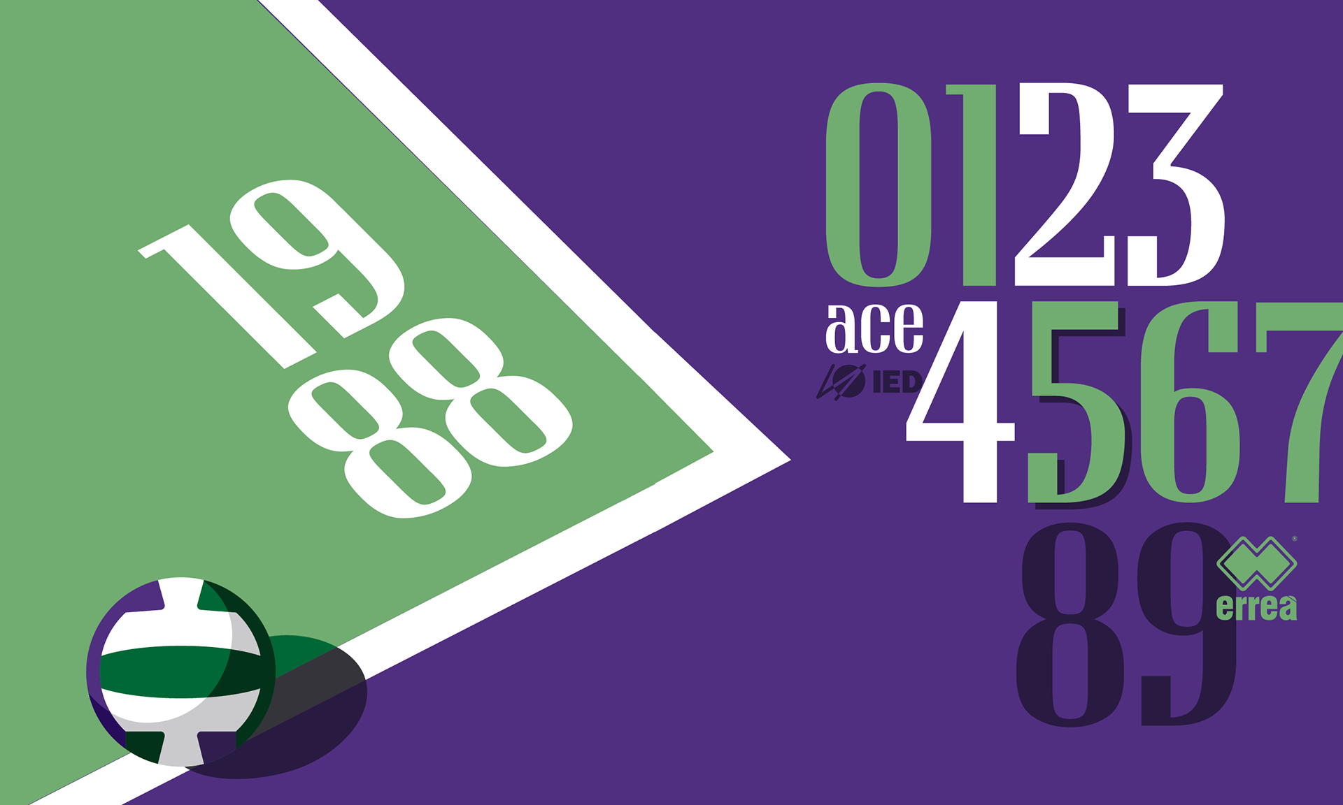
Erreà in collaborazione con IED - Istituto Europeo di Design Milano ha progettato quattro FONT personalizzati per le numerazioni dei suoi prodotti sportivi.
Grazie alla collaborazione con IED Milano, uno dei principali istituti di design al mondo, e il coinvolgimento del docente, type and Graphic Designer Nunzio Mazzaferro di Collletttivo, a coordinare il team internazionale del corso triennale di Graphic Design composto da: Alessandro Gallina, Arina Ilchenko, Daniele Colombo, Daria Varcalli, Anka Pavlovic, Camilla Pessina, Simone Passante e Tamara Hruska hanno preso vita i nuovi FONT chiamati Midfield Pro,Korner, Offside, e Ace destinati alle numerazioni e personalizzazioni di una vasta gamma di prodotti Erreà, tra cui maglie sportive, felpe e tute da allenamento.
Erreà, in collaboration with IED - Istituto Europeo di Design of Milano, has designed four custom FONTS for the numbering of its sports products.
Thanks to the collaboration with IED Milano, one of the leading design institutes in the world, and the involvement of the teacher, type and graphic designer Nunzio Mazzaferro of Collletttivo, coordinating the international team of the three-year Graphic Design course composed of Alessandro Gallina, Arina Ilchenko, Daniele Colombo, Daria Varcalli, Anka Pavlovic, Camilla Pessina, Simone Passante, and Tamara Hruska, the new FONTS named Midfield Pro, Korner, Offside, and Ace have come to life. These fonts are intended for numbering and personalization of a wide range of Erreà products, including sports jerseys, sweatshirts, and training suits.
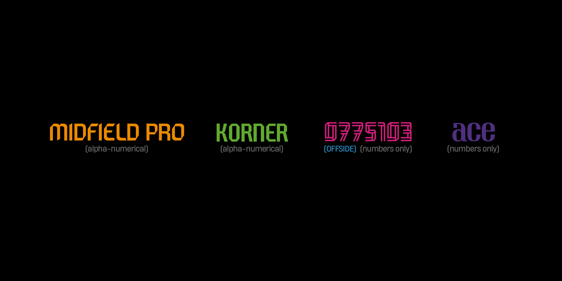
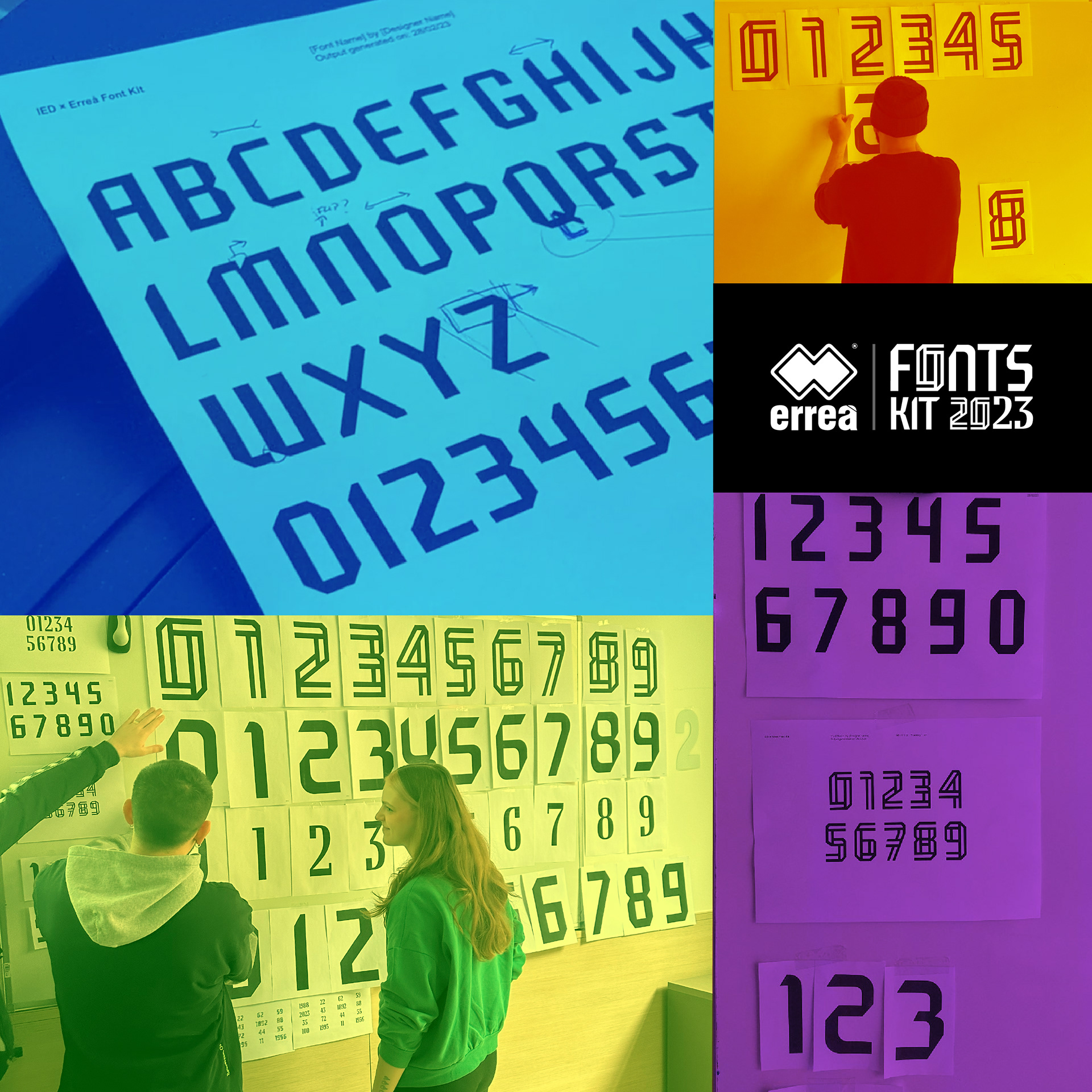
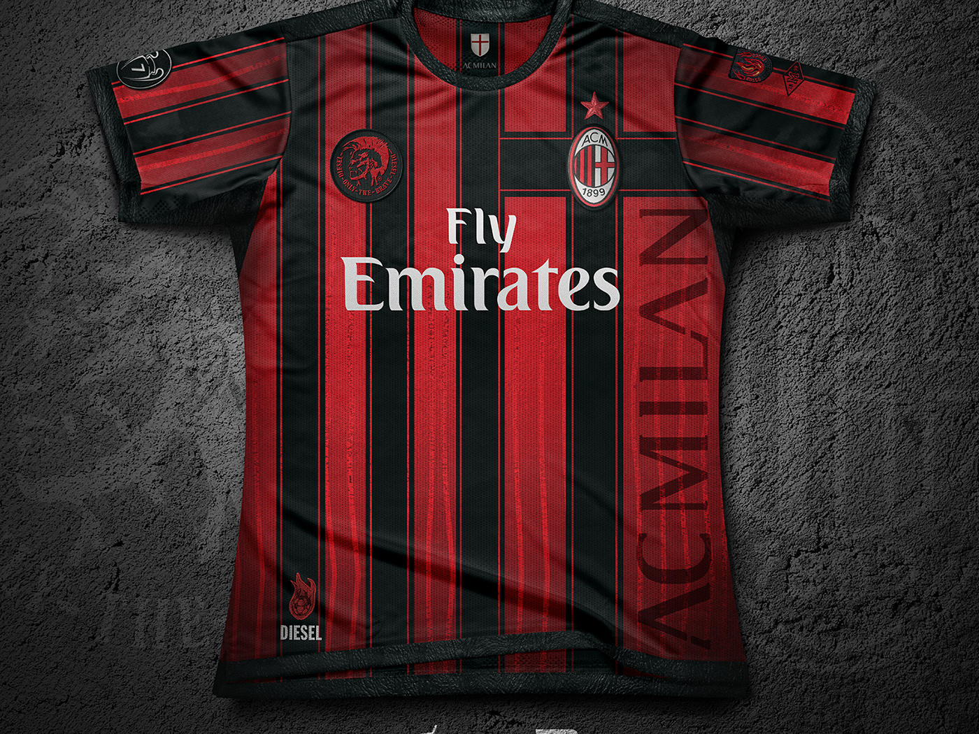
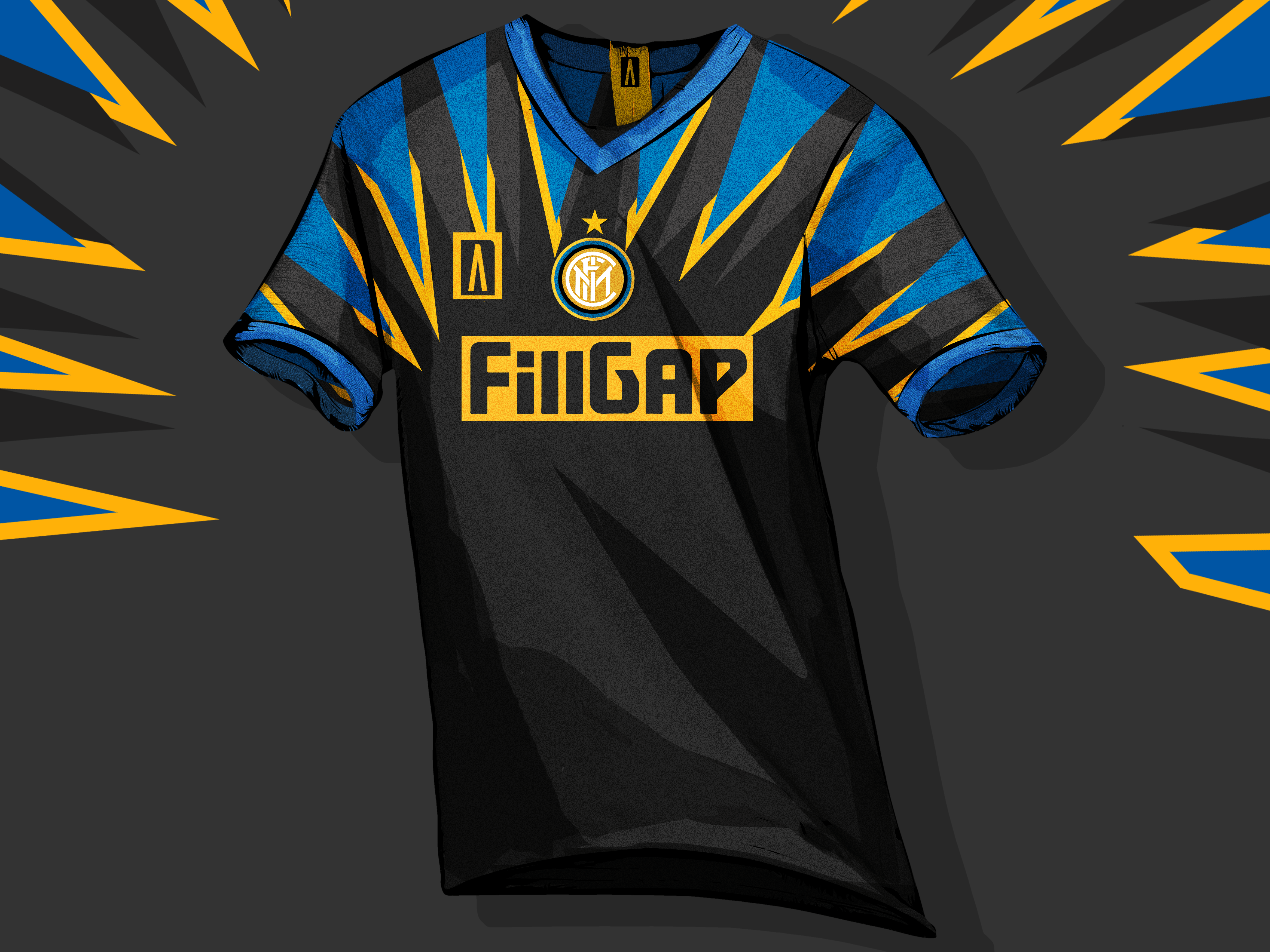
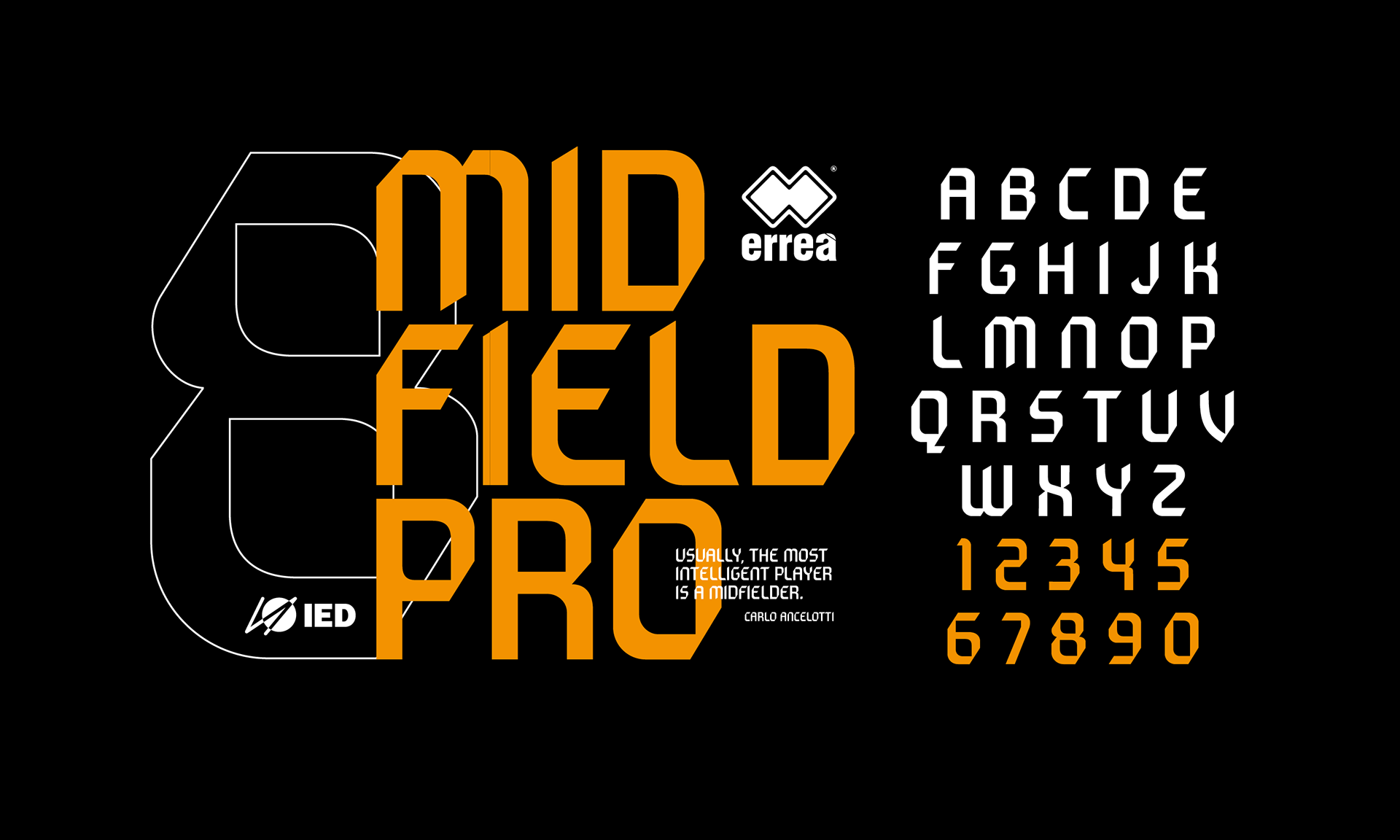
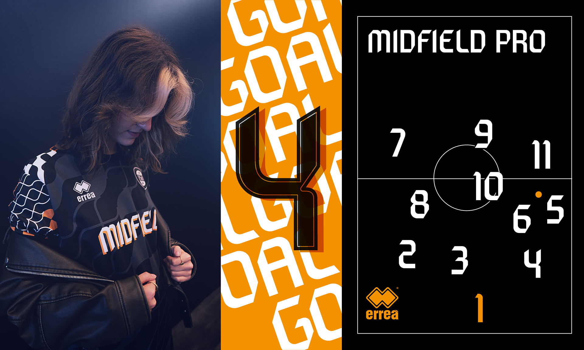
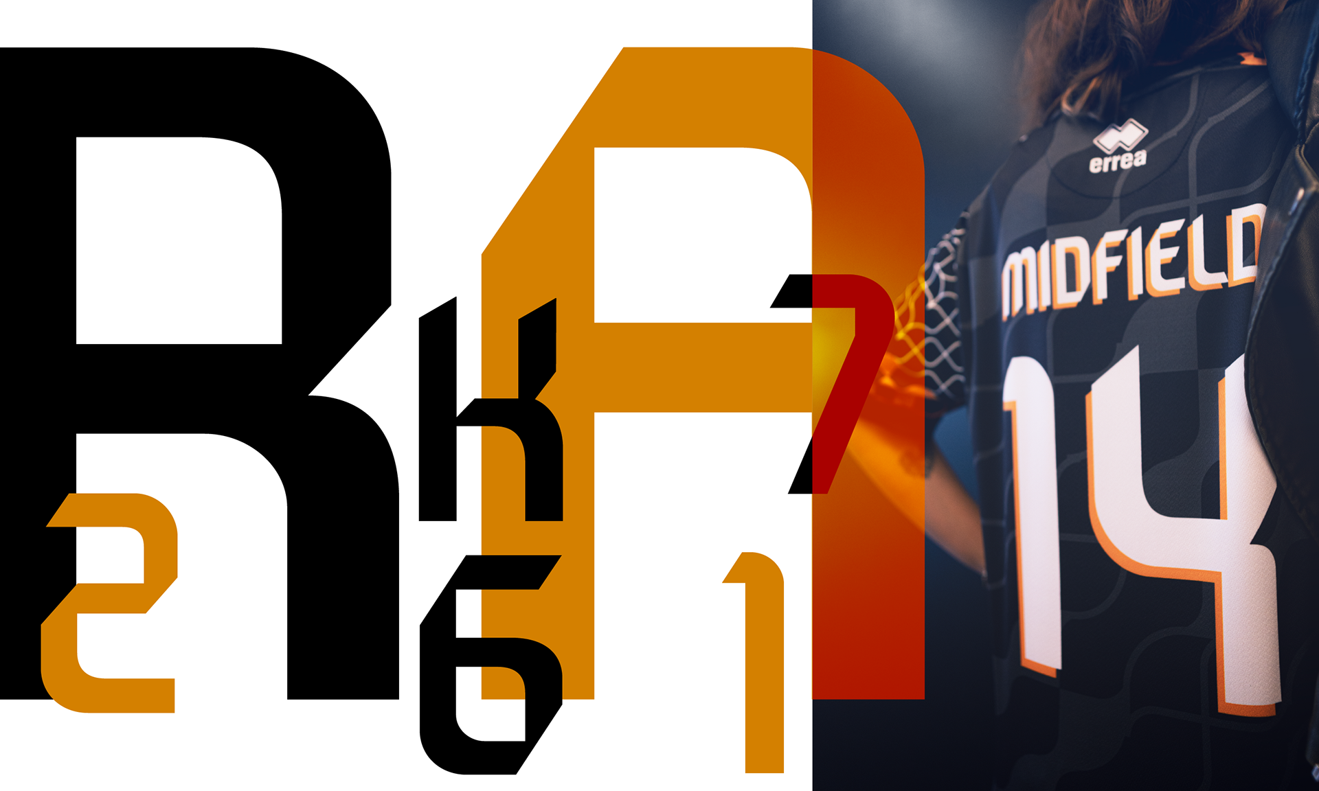
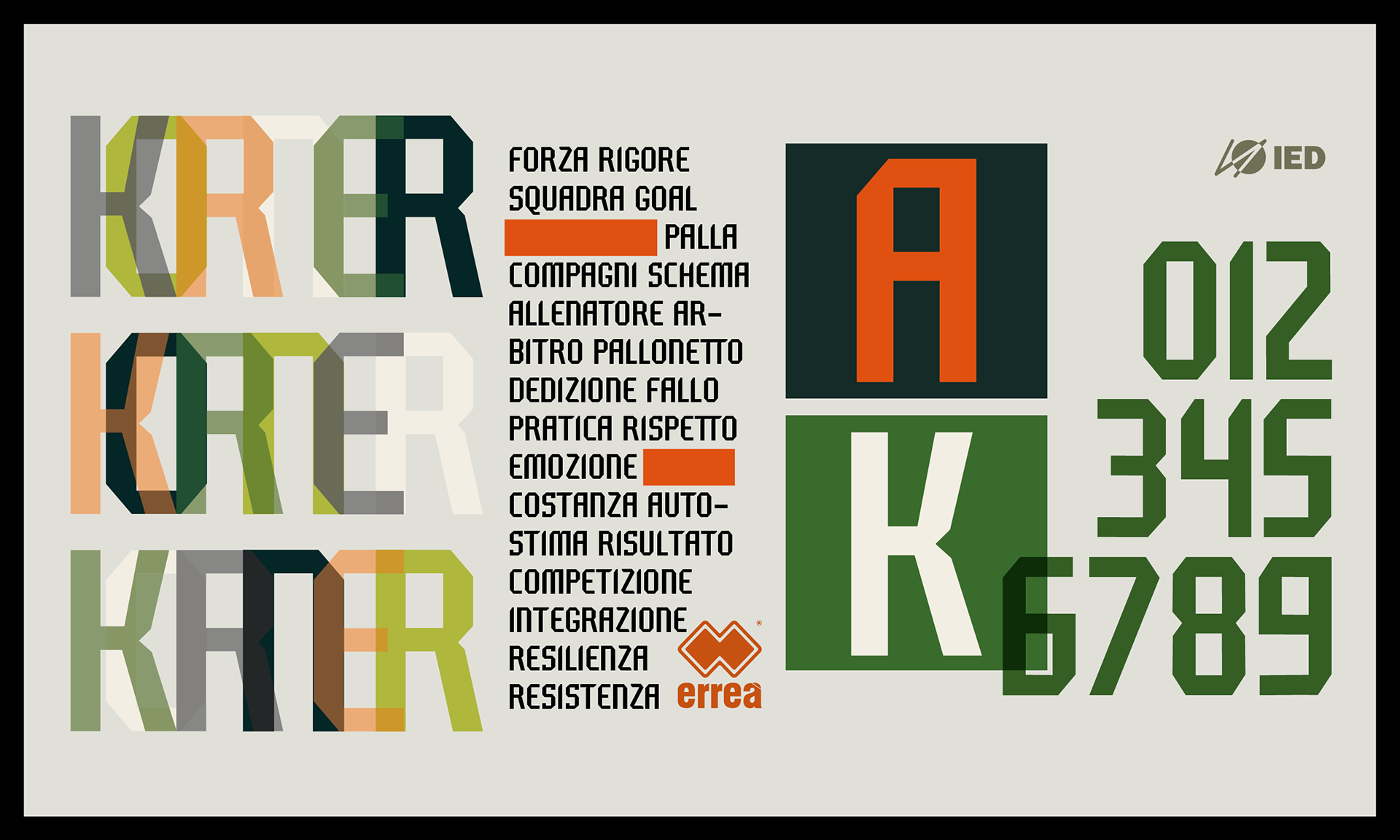
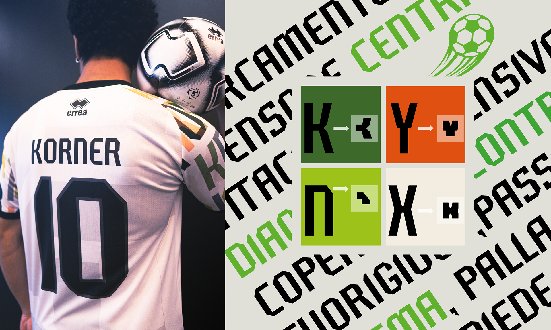
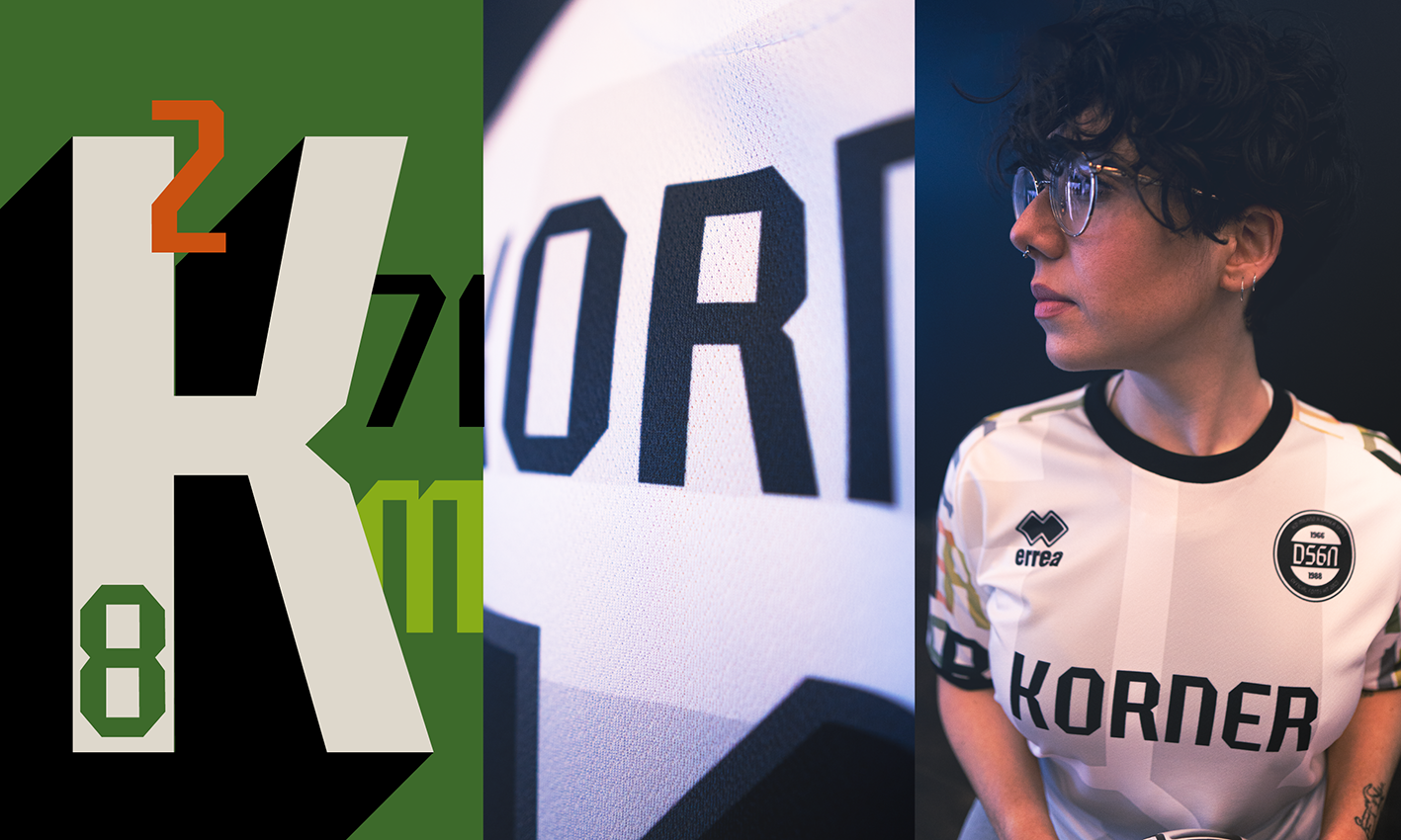
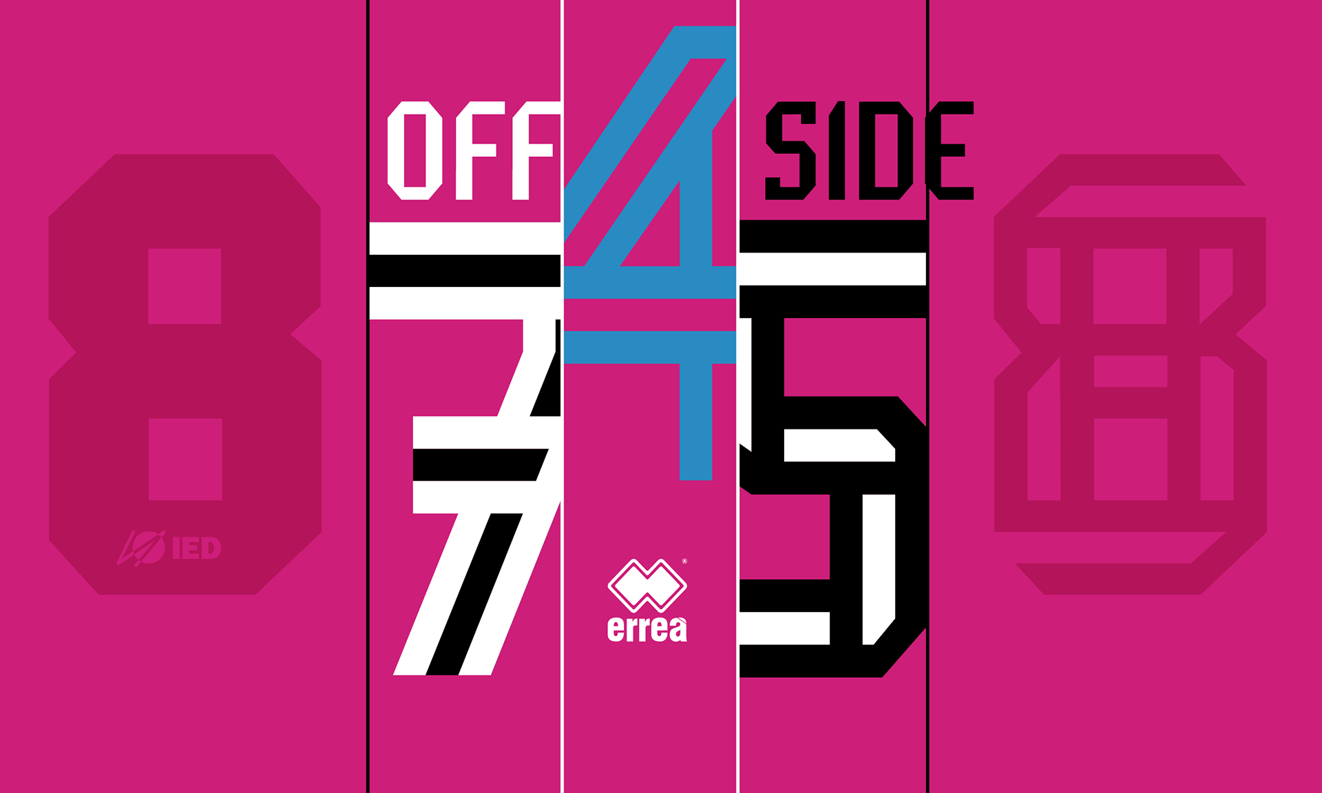
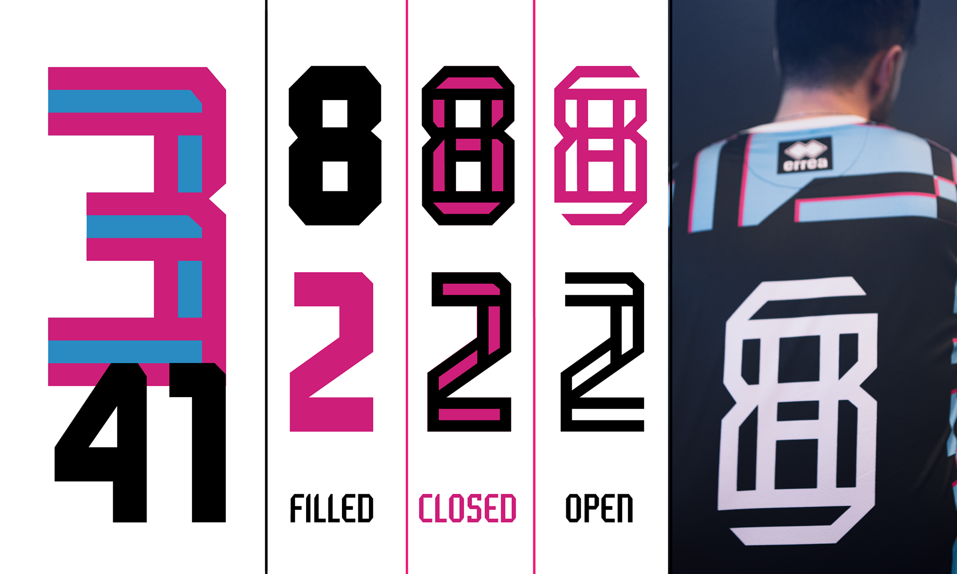
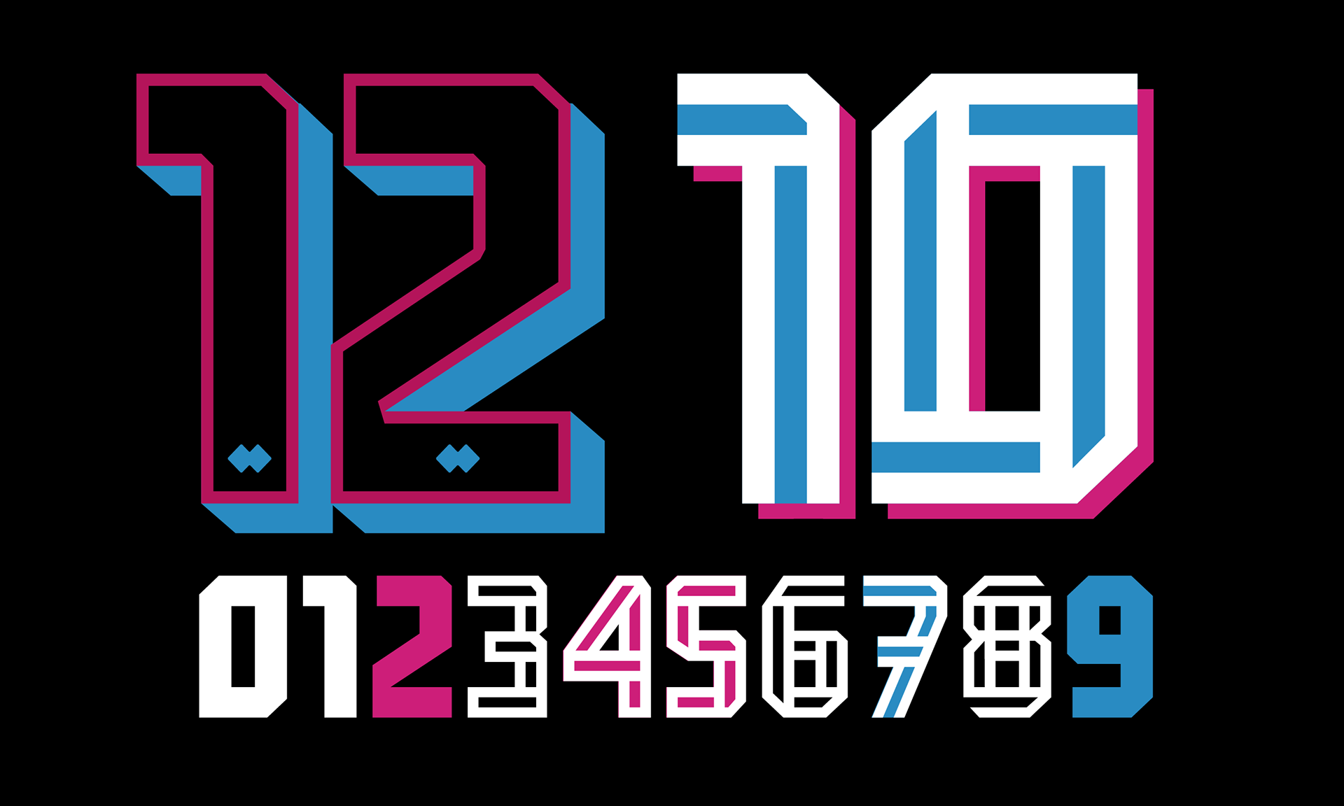
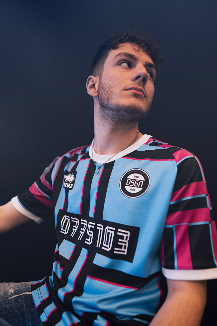
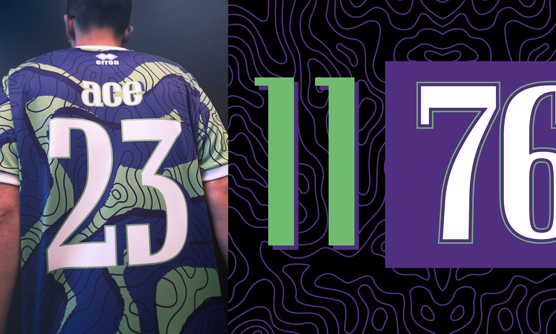
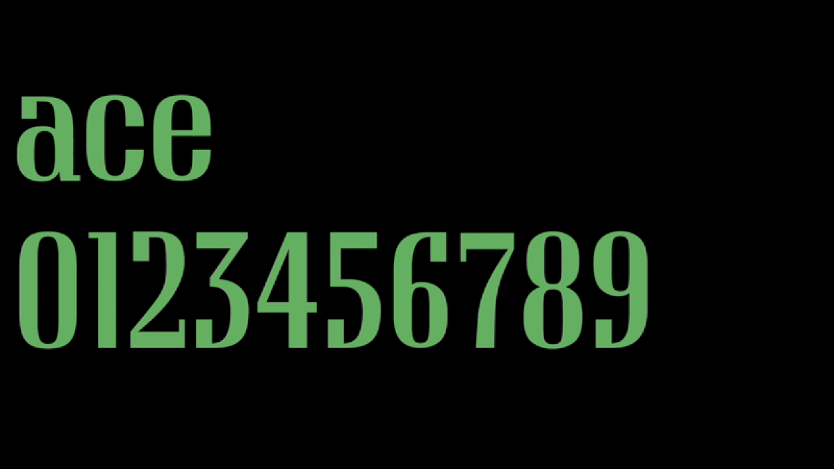
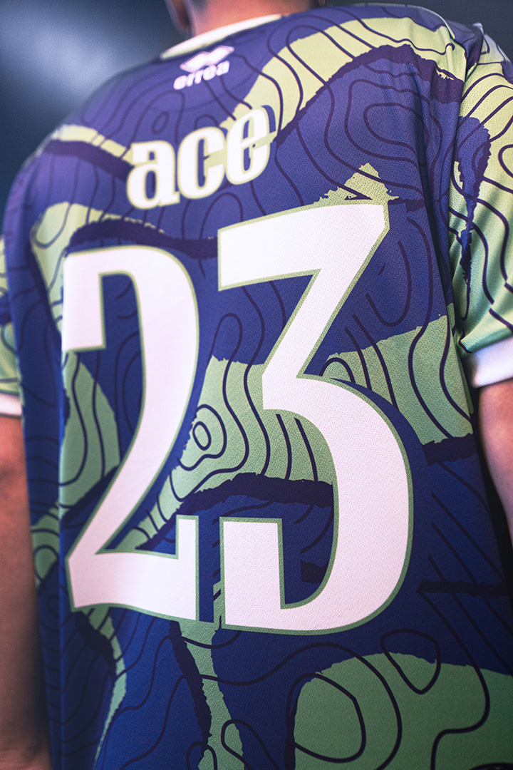
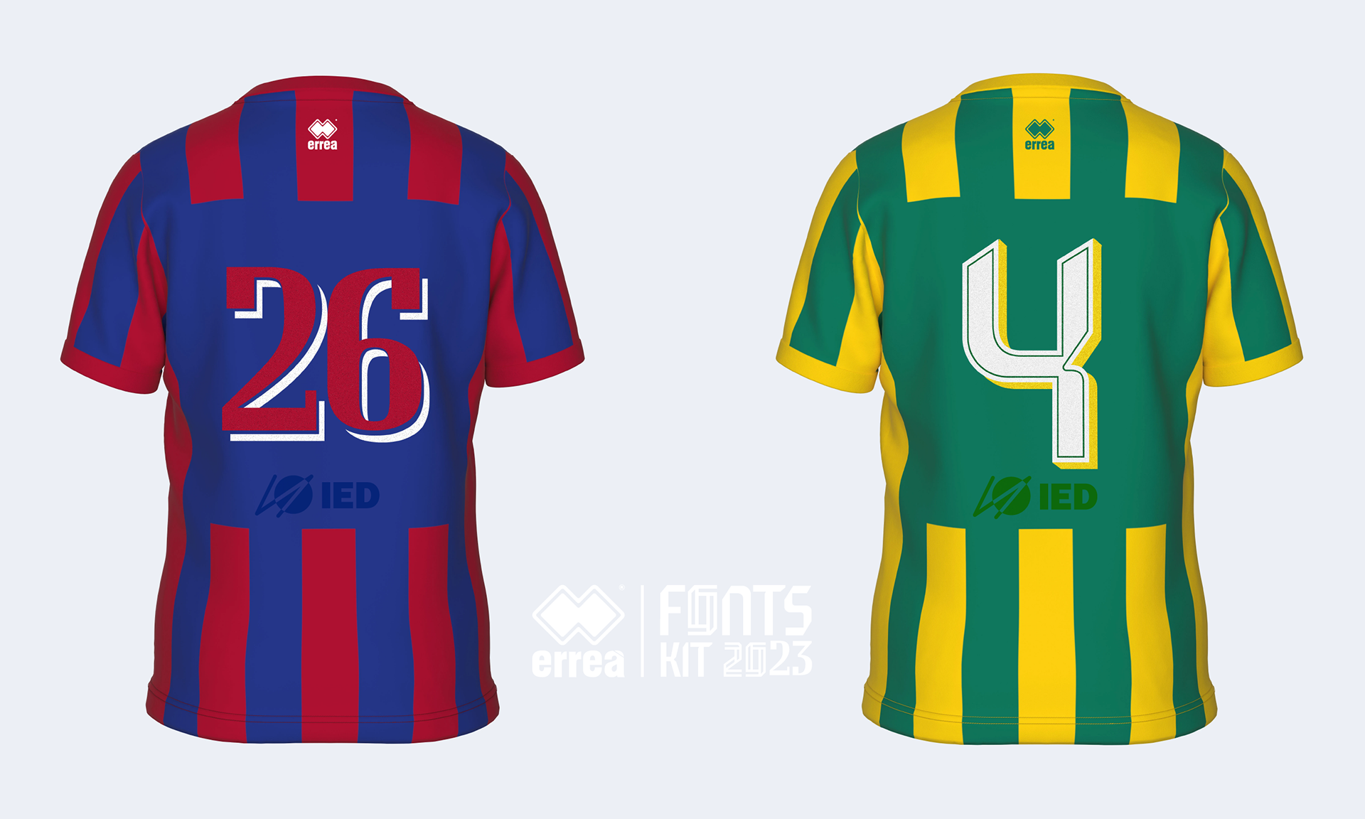
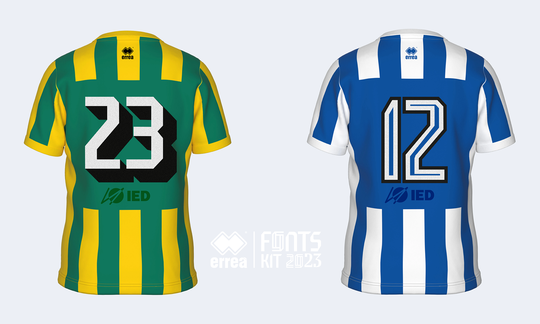
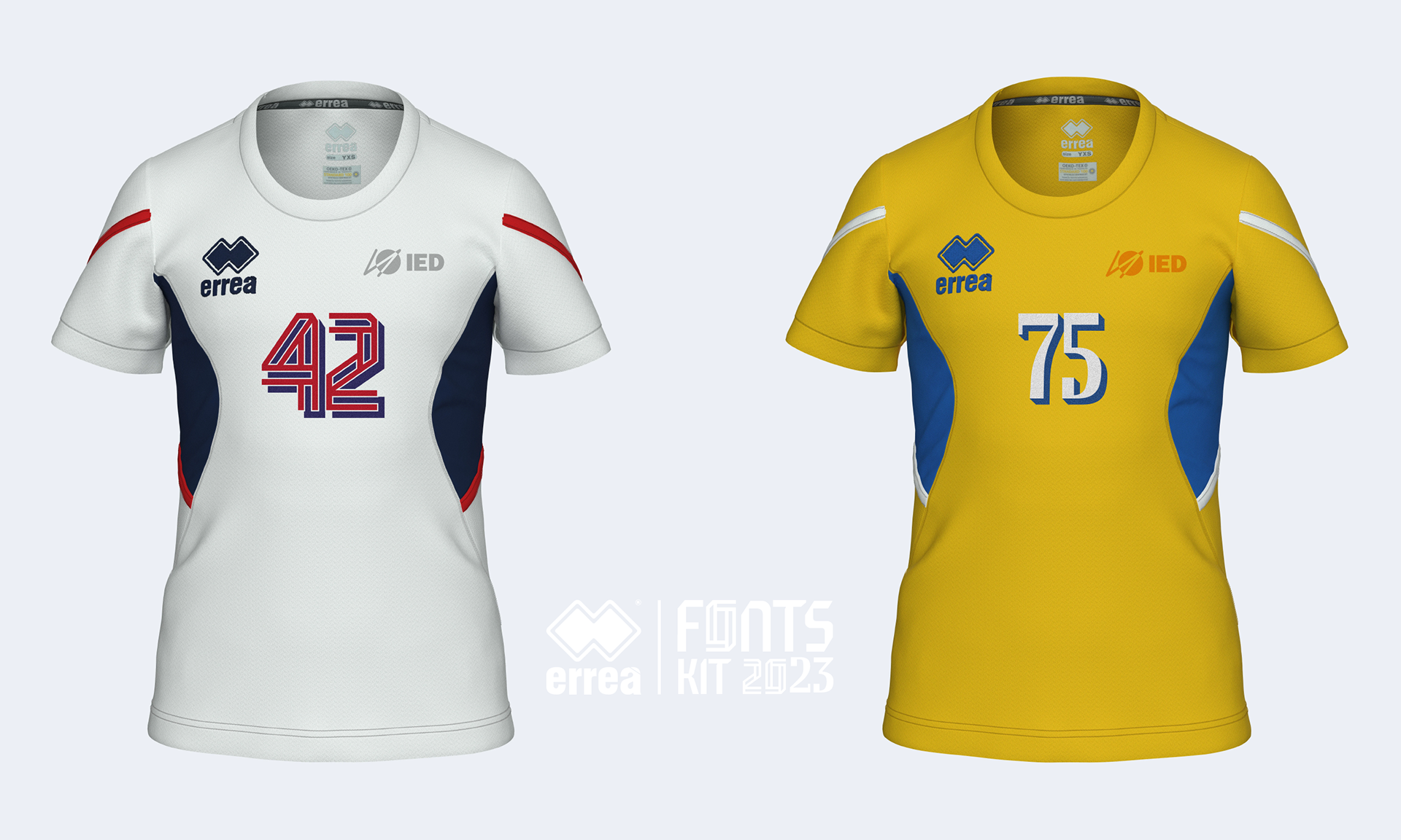
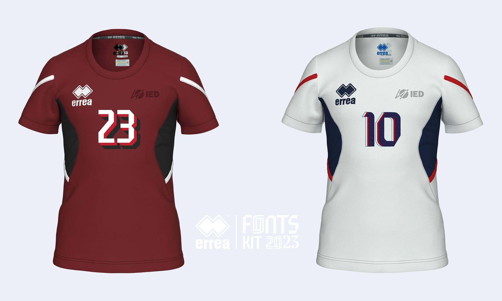
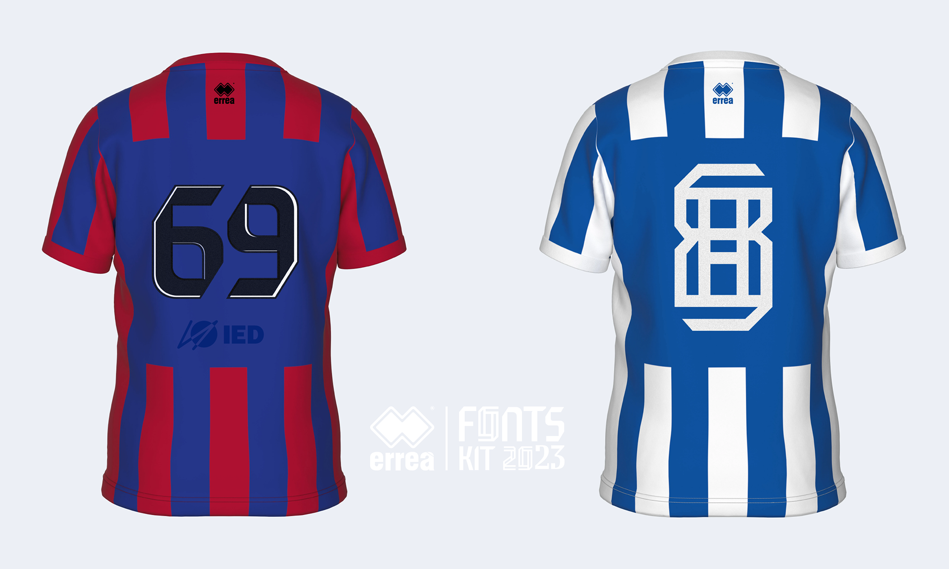
KORNER è un font ispirato alle forme geometriche del logo dell'azienda, è stato progettato per la lettura in situazioni di alto movimento e di grande lontananza, come accade in campo. OFFSIDE, invece, trae ispirazione dalla visualizzazione dei numeri sul segnapunti e riflette la sua natura geometrica e adatta alle regole precise delle griglie. Midfield Pro, è un font dinamico e geometrico con contrasti di spessore e facilmente leggibile, mentre Ace, è un carattere tipografico semi-graziato che deriva l'eleganza dall'unione di linee curve e rette, che gli conferiscono un aspetto deciso ma armonioso.
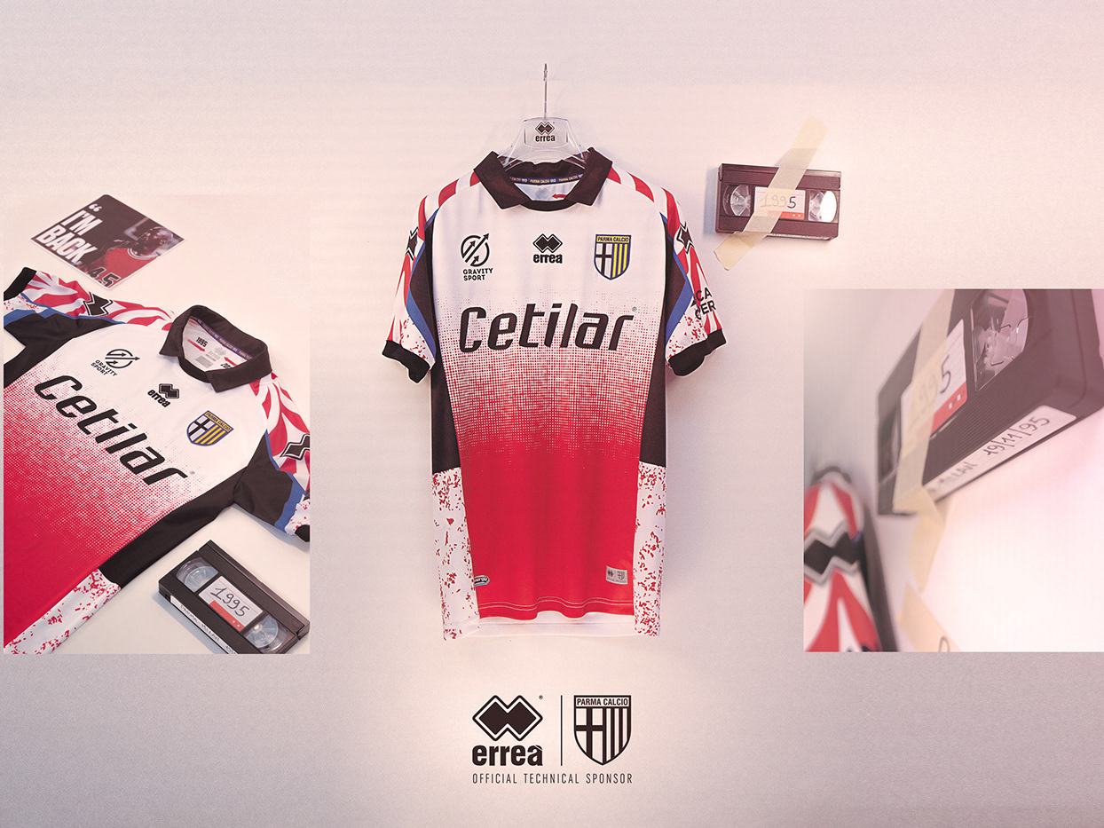
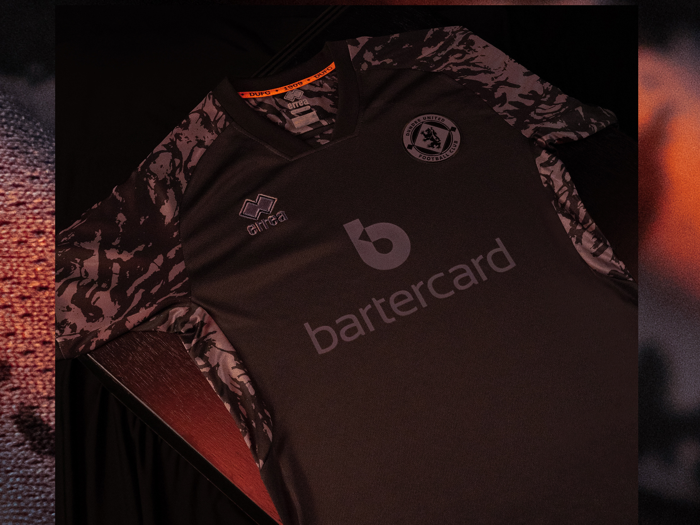
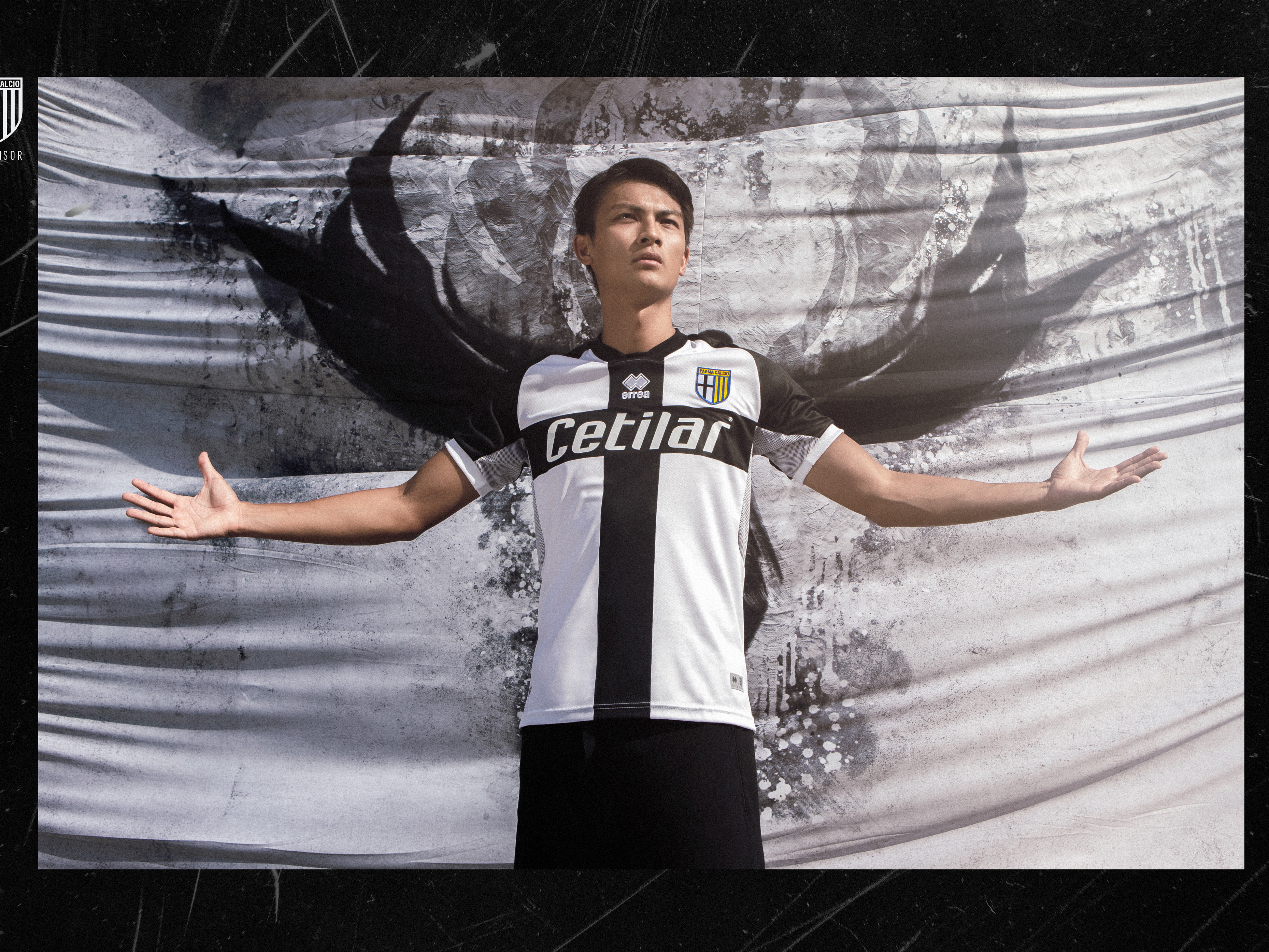
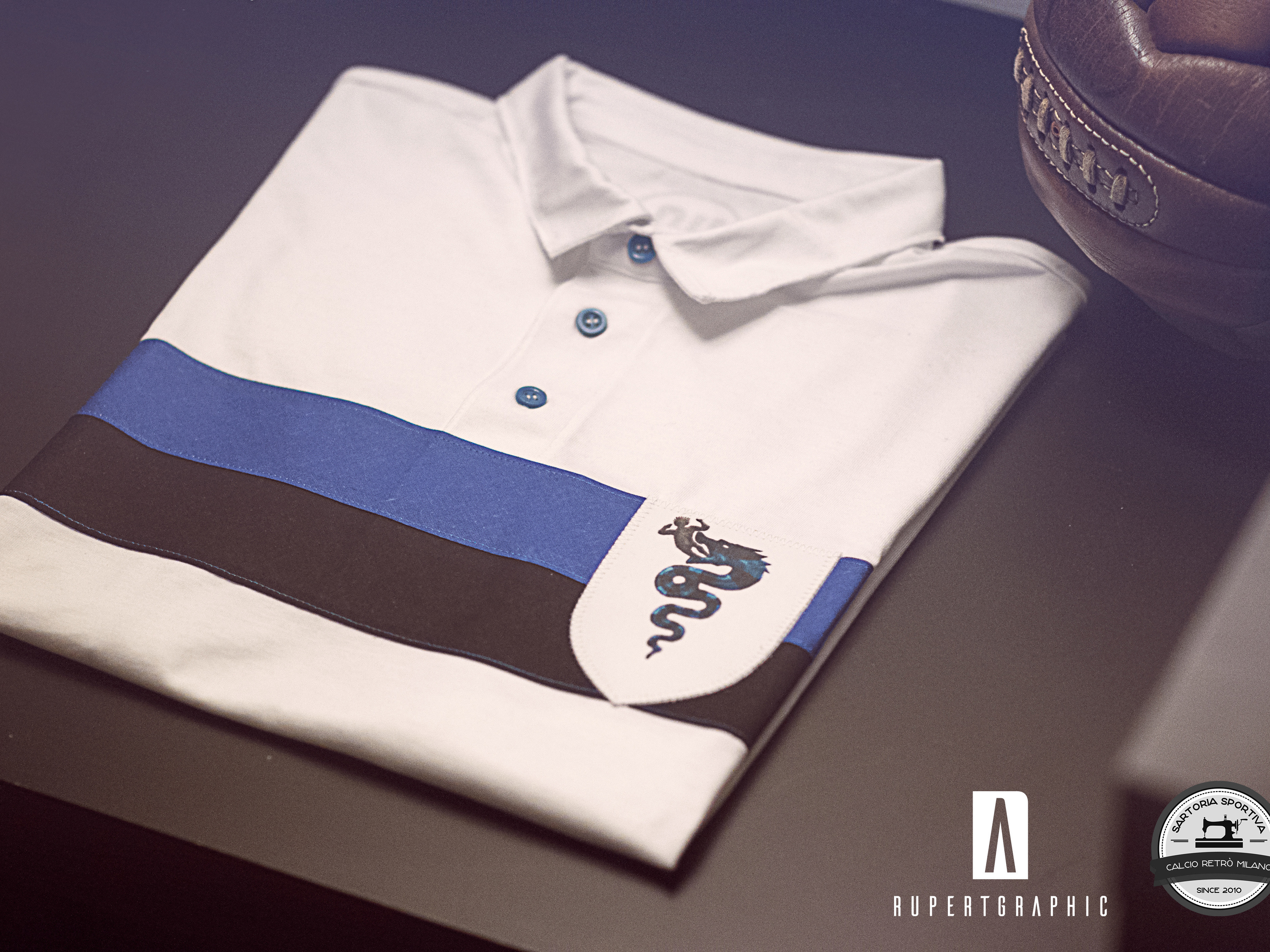
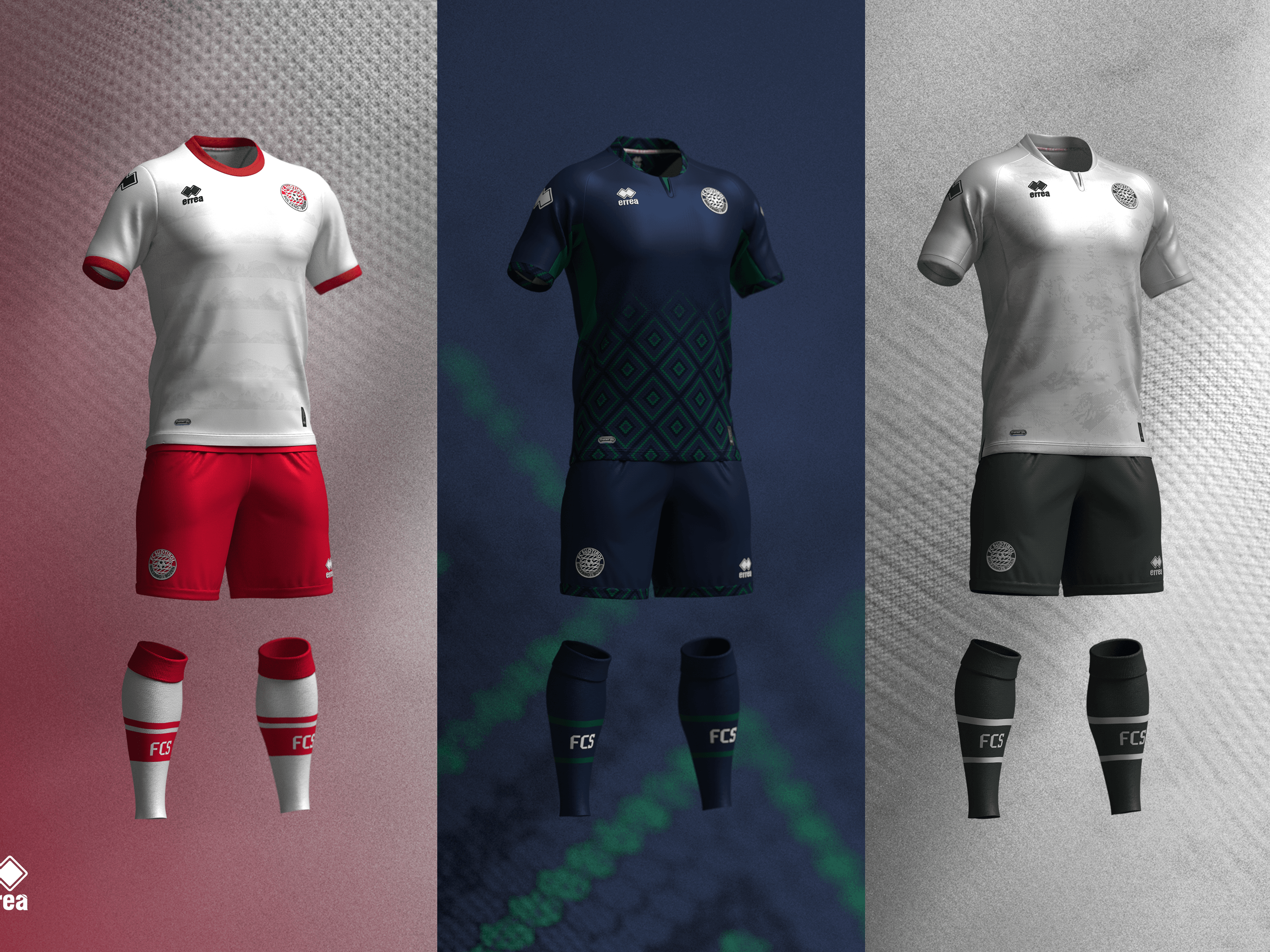
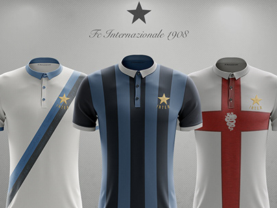
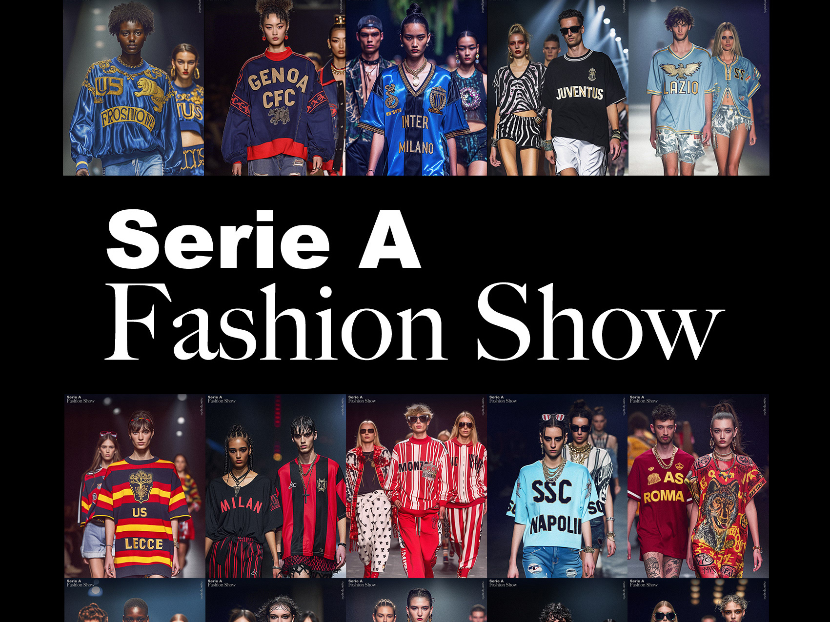
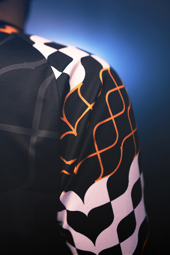
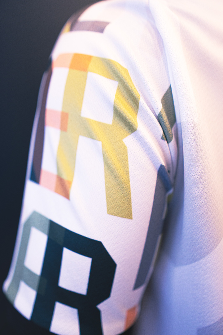
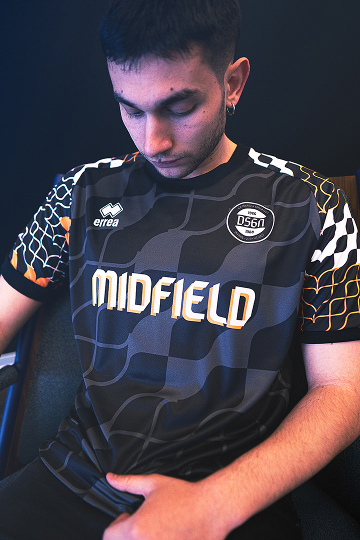
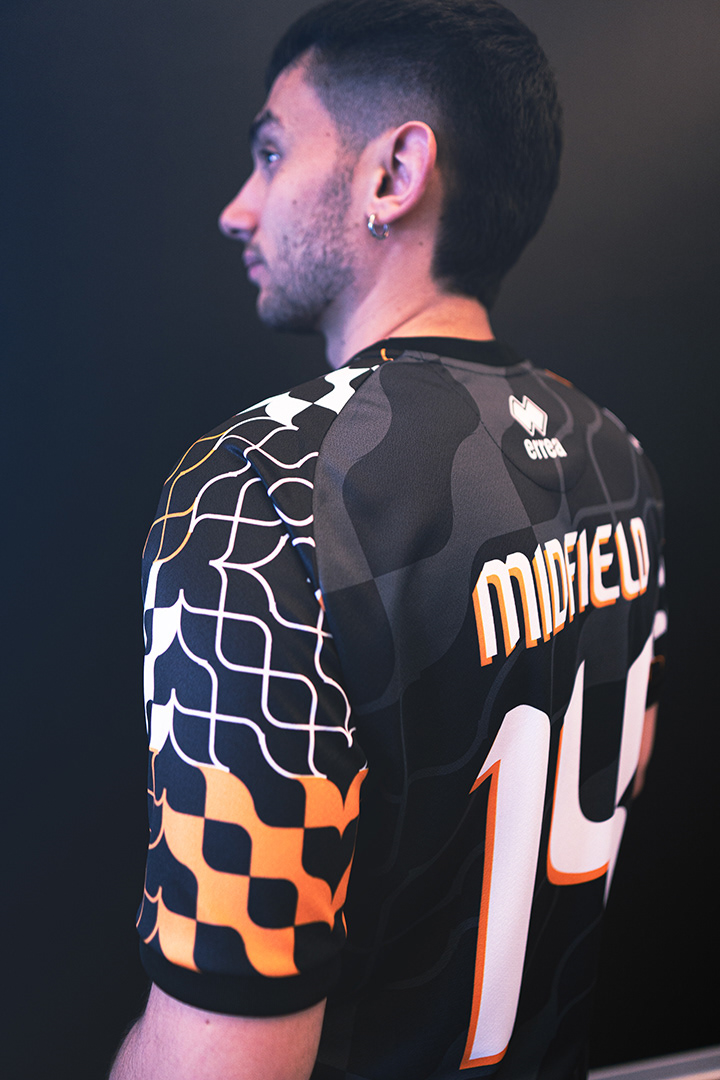
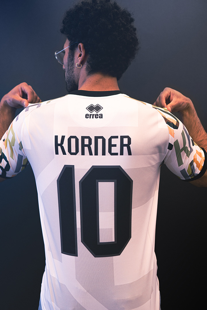
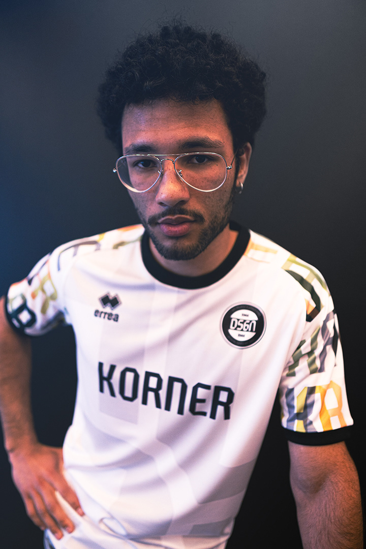
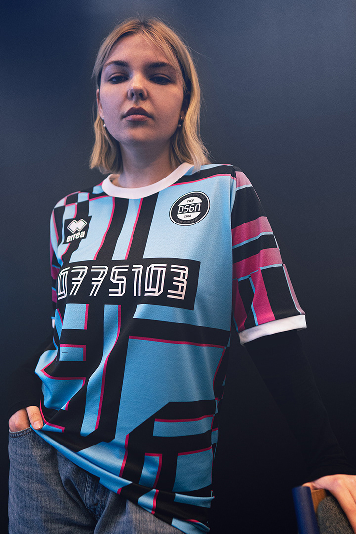
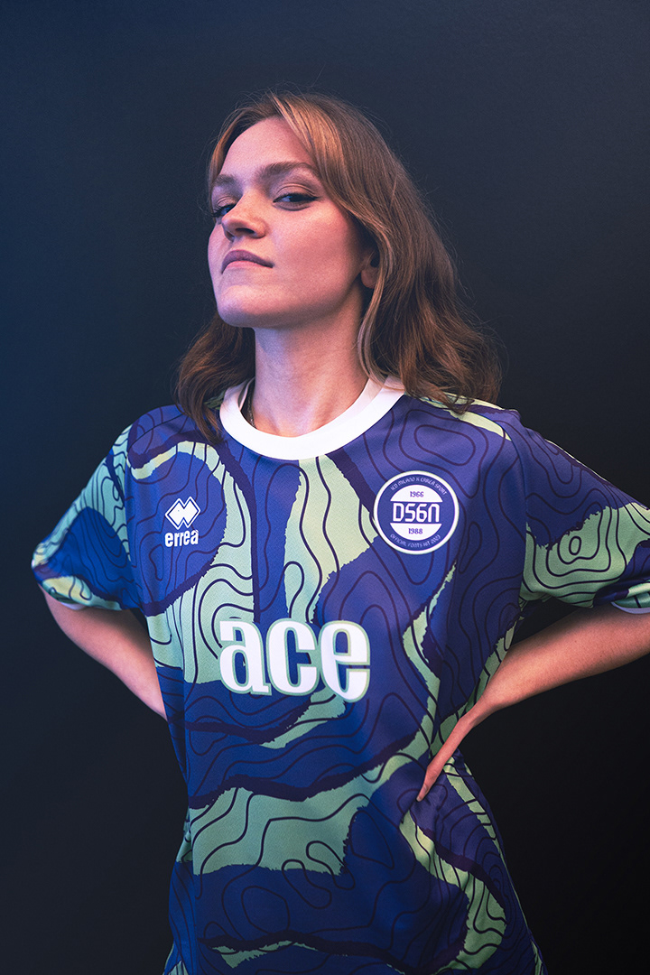
Per dare visibilità al progetto, è stato organizzato uno shooting fotografico, che mette in risalto l'estetica e l'originalità dei nuovi font su delle maglie realizzate ad-hoc.
“Con questa collaborazione abbiamo avuto l'opportunità di coniugare la nostra esperienza consolidata con la freschezza e l'energia creativa dei giovani designer coinvolti. I risultati ottenuti sono stati sorprendenti perché rappresentano una perfetta sintesi tra la nostra identità aziendale e l'estro creativo dei designer. Grazie ai nuovi font, le maglie diventano un vero e proprio strumento di comunicazione visiva, in grado di trasmettere messaggi e valori che vanno oltre il semplice aspetto numerico ed alfanumerico.”
-- Roberto Gandolfi, Vice Presidente di Erreà
Inoltre, il Coordinatore del corso di Graphic Design IED Milano, Giuseppe (BOB) Liuzzo, sottolinea l'importanza dei simboli visivi nella rappresentazione dell'identità di un'azienda o di una squadra:
"gli studenti/esse hanno progettato quattro font esclusivi che possano trasmettere la passione, la storia e l'innovazione che una squadra che si rivolge ad Erreà potrebbe voler esprimere. Questi font si integrano perfettamente con il brand Erreà, rinomato per la qualità dei suoi prodotti, consentendo alle squadre che scelgono di indossare i loro capi di abbigliamento di rappresentare con stile e personalità l'identità del brand e di consolidare la propria identità come squadra."
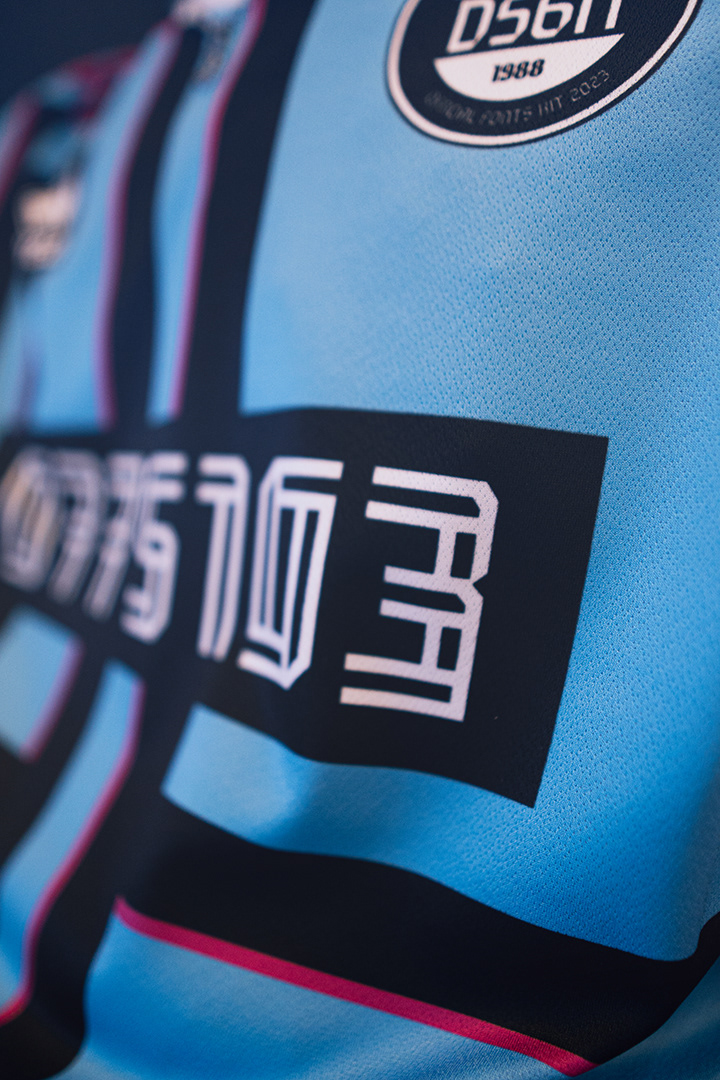
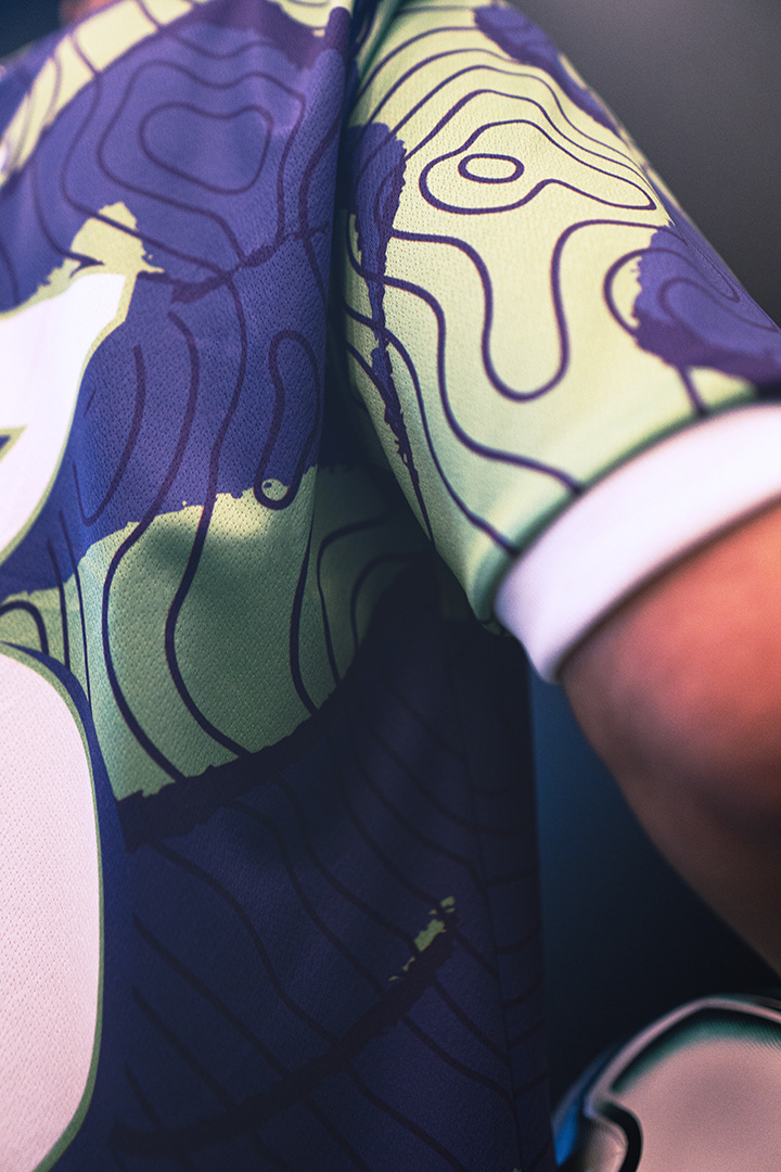
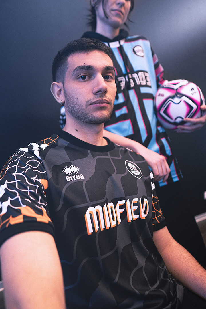
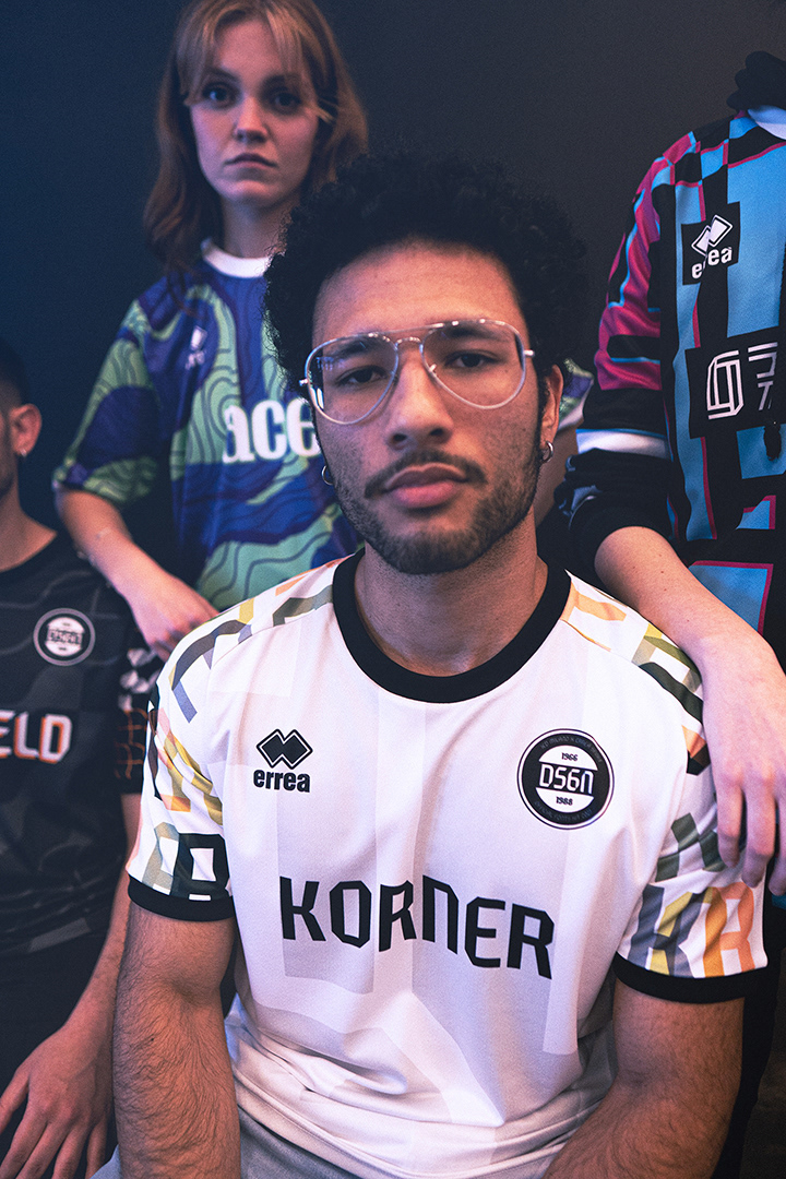
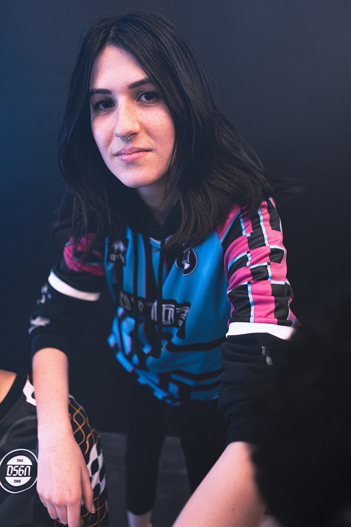
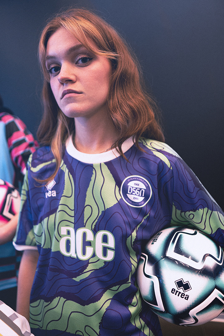
KORNER is a font inspired by the geometric shapes of the company logo, designed for readability in high-movement and long-distance situations, as experienced on the field. OFFSIDE, on the other hand, draws inspiration from the display of numbers on scoreboards and reflects its geometric nature, suited for precise grid rules. Midfield Pro is a dynamic and geometric font with thickness contrasts and easy readability, while Ace is a semi-serif typeface that derives elegance from the combination of curved and straight lines, giving it a decisive yet harmonious appearance.
To showcase the project, a photoshoot was organized, highlighting the aesthetics and originality of the new fonts on specially made jerseys.
"With this collaboration, we had the opportunity to combine our established experience with the freshness and creative energy of the young designers involved. The results obtained have been surprising because they represent a perfect synthesis between our corporate identity and the creative inspiration of the designers. Thanks to the new fonts, the jerseys become a real tool for visual communication, capable of conveying messages and values that go beyond mere numerical and alphanumeric aspects."
-- Roberto Gandolfi, Vice President of Erreà
Furthermore, Giuseppe (BOB) Liuzzo, the Coordinator of the Graphic Design course at IED Milano, emphasizes the importance of visual symbols in representing the identity of a company or team:
"The students have designed four exclusive fonts that can convey the passion, history, and innovation that a team turning to Erreà may want to express. These fonts seamlessly integrate with the Erreà brand, renowned for the quality of its products, allowing the teams that choose to wear their garments to stylishly and personally represent the brand's identity and consolidate their own identity as a team."


Project Director:
Giuseppe (BOB) Liuzzo
Coordinator of Graphic Design BA
IED Milano
Design Director
Annunziato (Nunzio) Mazzaferro
Type Designer & IED Professor at IED Milano
Founder of Collletttivo.it
Project and Photo-shooting Supervisor
Albero Mariani (RupertGraphic)
Creative Designer Erreà Italia
Giuseppe (BOB) Liuzzo
Coordinator of Graphic Design BA
IED Milano
Design Director
Annunziato (Nunzio) Mazzaferro
Type Designer & IED Professor at IED Milano
Founder of Collletttivo.it
Project and Photo-shooting Supervisor
Albero Mariani (RupertGraphic)
Creative Designer Erreà Italia
Design Team:
*Alessandro Gallina
*Arina Ilchenko
*Daniele Colombo
*Daria Varacalli
Anka Pavlovic
*Camilla Pessina
*Simone Passante
*Tamara Hruska
*Models:
Josè Heitor Barbosa
Costanza Pessina
*Arina Ilchenko
*Daniele Colombo
*Daria Varacalli
Anka Pavlovic
*Camilla Pessina
*Simone Passante
*Tamara Hruska
*Models:
Josè Heitor Barbosa
Costanza Pessina